
We are recognised as authorities in our specialised fields. We publish newsletters with informed opinions that are free for you to subscribe to.
Fuelling the debate: Wealth report
The June 2024 wealth report is out, revealing both predictable patterns and surprising trends. We’ve endured three tough years, household debt is rising, our love affair with property continues, and wealth compounds over time. But dig deeper and you’ll find unexpected revelations about education returns, capital flight, intergenerational wealth transfers and demographic shifts that should concern us all.

But is the data reliable?
But seriously, do we really believe that entering the top 0.5% of households in New Zealand requires only $11.5 million of net worth (assets minus liabilities)? If it requires more, then aggregate household wealth will be higher at all levels.
The report says aggregate New Zealand household wealth across around two million households is $2 trillion and change, about $1 million per household. Not much more than the average house value, assuming no debt. The top 10 US-listed companies are worth 15 times the household net worth of every New Zealand household combined.
I tested this by looking at the top 0.5%, the top 9,995 households. Forty years ago, Gilligan Sheppard had two clients in that category. We now have 64, with clearly more than $11.5 million. With team growth and ageing clients factored in, we should have around 30 based on headcount alone. This suggests either we’ve outperformed in growing wealth or the entry threshold is higher. Probably a mix of both.
Our love of housing provides good data on house numbers, values and owner-occupied housing. Comparing this to the wealth survey shows the wealth report might be reasonably accurate. (Refer to the full report for detailed housing data comparison.)
Limitations and confusion
The data hThe data has limitations that raise questions about its accuracy.
It excludes business assets and liabilities but includes household equity in those businesses and assets held in trusts.
At 30 June 2024, unincorporated businesses were valued at $54 billion. Assuming 600,000 small businesses with 60% unincorporated, each averages $150,000. That feels high.
“Shares held in corporations” totals $45 billion. If this represents only private company equity, including unincorporated businesses, the total business assets would be $99 billion. The NZX market cap is around $190 billion.
My instinct says $45 billion for private corporations is materially incorrect. Consider:
- 200+ Pak’n’Saves and New Worlds at $10 million each
- 4.7 million dairy cows on 1.5 million hectares of prime land
- Large private construction companies, dealerships, manufacturers like Carter Holt Harvey
Private business value could be twice the NZX cap ($380 billion), suggesting a $335 billion understatement.
Worth exploring, but the numbers may be close enough. They’re consistently prepared, and the trends tell their own story.
The reported data
Set out below are the high-level numbers since 2015.

Pre-Covid, household wealth growth was reasonable. Between June 2018 and June 2021, it slowed, then reverted to normal (all nominal dollars). Debt to assets increased slightly during Covid and stabilised at 14%. Interestingly, ultra-low borrowing rates didn’t materially increase borrowing beyond what escalated with asset value growth.
This, however, ignores population growth and inflation. Adjusted for those factors, we’ve had nine years of steady decline in real net worth per household. Households accrued 1% real asset growth annually in the last three years, 2% in the previous three.
This is a blend of many things. Savings rates likely declined during the recession; income generation and asset values have been a rollercoaster, and population and capital flows matter. Anecdotally, pre-2018, we were getting more wealthy migrants than now. The balance suggests we may be exporting more wealthy households than importing over the last three years, at least.
Where do we invest?
We know asset allocation drives both risk and return. Here is a snapshot of NZ investing habits and how they have changed over time (again, averages over 2m households).
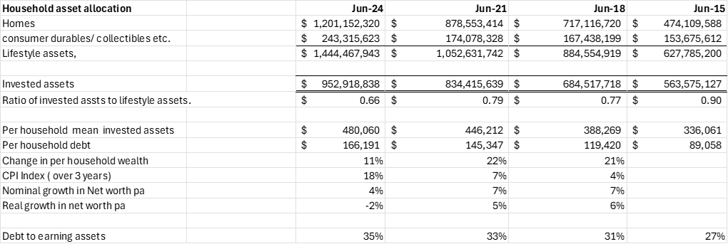
At June 2015, we had 90 cents of investments earning a return for each dollar invested in houses and toys. That’s now 66 cents. Post-Covid, we went mad buying toys, spending a whopping $69 billion on frippery.
A significant part of this decline is the massive increase in owner-occupied housing values. The average household home increased 214% in value over nine years since June 2015. Investment assets only grew 43% (all nominal dollars).
Our attitude to housing
Our attitude to homes is a real problem and probably explains migration patterns, productivity and opportunity creation issues. A home produces nothing more than utility for its occupants. Over nine years, we’ve spent income or savings to improve housing quality, but that’s just increased consumption, not wealth production.
We’ve financed a chunk of this with debt, which increased 89% per household over the past nine years, faster than investment asset growth! Some of this will be equity release loans that effectively fund other consumption, and some will be invested in actual housing stock expansion. The shift in the last three years from 78 cents invested assets per dollar in housing to 66 cents reflects diverging housing values relative to invested asset values.
Why has invested asset accumulation stalled?
Like I said, the last three years have been tough, which means households have probably used their savings to back-fill the cost-of-living gap.
Investment income may also have been flat. After the Covid meltdown in early 2020, quantitative easing drove a massive bubble that then came back down through to 2024. But when you look at the full six years, investment returns were about average.
Migration is also another likely factor. Immigrants are probably bringing in less wealth than departing Kiwis are taking out. Net worth growth has dropped from a consistent 5-6% annually to minus 2% in real terms.
Based on business and equity returns being around 12% after tax, cash around 2%, and property including rents around 4% (adjusted for inflation and the property rollercoaster), the real return should be around 2%. Assuming wealth consumed at 2% annually for the cost-of-living crisis, you’d expect zero growth. At minus 2%, it suggests 6% wealth leakage through migration or capital flight over three years. I’d estimate that to be $50 billion.
Our investment mix is changing
The starkest change in our investment portfolio is reduced business equity, both in unincorporated businesses and corporate investments. This suggests that large businesses have sold or closed, or smaller businesses have faded away. Business formation rates are dropping, or mature private business sale rates are climbing.
Equity allocations have dropped from 40% to 34%. That’s an 11% total reduction in growth assets, redeployed into cash (1%) and property (8%). We don’t just love our own homes. We love owning other people’s homes, too.
Pension fund assets are steadily growing, largely through KiwiSaver. This allocation change partly reflects an ageing population, but it signals that future wealth growth will be more constrained. Future wealth growth will largely come from attracting more foreign capital than we lose through departures.
How does our wealth distribution rank globally?
While $1 million average doesn’t seem much to some, it’s a fortune to others. But, on average, how do we rank?
Wealth disparity is measured by something called the Gini Coefficient; higher scores mean more wealth concentrated in fewer hands. 100 would mean all the wealth is held by one person, and zero would mean everyone in the nation possesses the same amount.
Only three countries have scores in the 50s (Qatar, Slovakia, and Belgium). New Zealand is the seventh most wealthy country per individual adult. We’re rich, but most wealth sits in property, unlike the countries above us. What is surprising is that our Gini Coefficient has dropped to 66.1, and as wealth typically concentrates, it is another echo of the capital flight of the wealthy.
We’re number seven on wealth, 23rd on wealth distribution, 21st on GDP (adjusting for tax havens) and 11th on happiness. But can we stay here? Wealth disparity is not the problem; income disparity and productivity are more likely our concern, and in part, that’s how we allocate our wealth between lifestyle and earning assets.
Who’s comfortable and who’s struggling
The number of relatively comfortable New Zealanders has increased from 8% of the population in 2015 to 19%. Accounting for 30% inflation over that period takes it to 10.5%, so the balance represents genuine improvement. The relatively poor dropped by 4%, around a 13% reduction.
However, what’s really evident is a shrinking middle class.
While we can pat ourselves on the back, the reality is that inflation hurts the poor more than the rich. The relatively poor decreased slightly in percentage terms, but in absolute terms, likely increased. The decline in the middle group is more problematic. It should be stable or increasing as our population ages, since the young (who make up a greater portion of the poor) have time to progress.
Our Gini Coefficient has dropped to 66.1. That’s surprising. In recessions, wealth generally continues to concentrate in the hands of the wealthy. This is another echo of capital flight, not of average citizens but of the wealthy.
How the wealthy behave differently
The wealthy invest more of their assets in equities than the average person. No surprises there. But the big surprise is they’ve either reduced their investment portfolios to buy bigger houses, their houses have appreciated more than average, or their equity investments have produced poor returns.
Wealthy homes have appreciated at nearly twice the median rate. Toys and chattels have increased much faster, too. Either the wealthy are substituting productive wealth into homes and accelerating spending, or inbound migrants buying homes are less wealthy than outbound migrants who sell homes and take their financial assets with them. Another echo.
The long-run lesson of the wealthy is to buy and grow businesses. Invest in productive assets that give you a return rather than holding cash or property. But that’s changing. Is it demographics and ageing, or the inevitable risk aversion as elderly boomers prepare for death? Or is it migration? Whichever it is, it’s a risk to our economic well-being and future wealth creation.
The wealthy are earning less than expected
The top quintile (the wealthiest 20%) is more egalitarian than the population. The median to mean ratio is gently falling over time, suggesting more people are entering at the bottom or serious wealth is breaking up or leaving. Another echo.
The return derived from assets by the wealthy is significantly less than the return derived by the mean. That’s completely counterintuitive based on their asset allocation. Some behavioural or demographic effect started in the last six years and is gaining momentum.
In the three years to June 2018, wealthy household asset growth was 50% more than the population mean. That makes sense based on asset allocation. Likely, inward migration of wealthy families was in equilibrium with departures. That has clearly changed.
Wealthy families tend to export their children more than the rest of the population. There’s also political fear of wealth taxes or capital gains taxes.
Let’s estimate wealth leakage. Assuming the wealthy earn 3% per year more in real terms than the mean (the June 2018 margin), wealth flight from the top quintile is 6% per year over the last three years. That’s 18% of wealth from June 2021, or $155 billion in three years.
The brain drain and its wealth effect
Education over the long term increases the mean wealth of those educated to higher levels. Those without an education are more likely to be stuck in the least wealthy 40%. Those with an education have much higher variation in wealth outcomes than the general population.
The highest marginal return is to leave school, get an entry-level skills certificate and skip university entirely. I doubt this is the case in the USA, Denmark, Switzerland or Luxembourg. Given our property assets to total assets ratio and attention spent on homes versus business, this might explain it.
What’s changing? The marginal return on higher education levels is strongly reducing. The population with doctorates is now 6.39%, up from 3.76% nine years ago. The marginal return dropped from $1.36 to $1.10.
The mean-to-median ratio advantage of education changed from a consistent 30% to 17% in the last three years. Those leaving versus arriving with education is likely a factor. Another echo.
The demographic time bomb
The wealth of 15 to 24-year-olds jumped in the three years to June 2021, but that’s not a $6 billion lift from young entrepreneurs. The 65 to 75-year-olds declined by 5%, out of pattern. Likely, large gifts among wealthy households occurred.
In 2021, we headed into the election with fear that the Greens would impose a wealth tax in coalition. That’s still a live threat. The wealthy voted Labour to give them an absolute majority and gave cash to kids or grandkids totalling $5 billion.
Now look at the 35 to 44 age band, our most productive portion. They moved from 5% real wealth accumulation in June 2021 to minus 3% in June 2024, suggesting widespread loss. That trend continues.
The parents of this group (75 plus) are starting to follow their kids. The mean-to-median ratio fell strongly, suggesting wealthy 75-year-olds (or older) are leaving to follow their educated children.
Closing
Muldoon, our National Prime Minister in 1983, said of a previous brain drain to Australia that it was “raising the average intelligence of both countries.”
At that time, we had currency controls and all manner of restrictions, so the brain drain was not also a wealth drain. Now it’s likely we’re lowering our average intelligence and draining our coffers as well.
The reasons for this appear to be two major factors. The tipping point of unproductive assets (housing) to the productive capacity to pay for them, and the fear created by the extreme left to tax those who don’t feel they have much.
The first factor drives our kids to pursue a better life elsewhere. The latter is the tipping point for driving their parents to join them.
Unless this trend is averted, our enviable position will dissipate very quickly on all scores.

AUTHOR:
Bruce Sheppard

- Bookkeeping (11)
- Bruce's (77)
- Business (154)
- Business Improvement (18)
- China (8)
- Covid-19 (23)
- Enriching (33)
- Events (28)
- GS News (68)
- Info Tech (16)
- Investment (25)
- IRD & Tax (53)
- Joshna's (34)
- Liftoff (7)
- Live Convos (20)
- Networks (7)
- Our Clients (23)
- Richard's (68)
- Yi Ping's (26)
- Tax Updates (171)
- Trusts (10)
- Valuations (3)
- Wealth (25)






If you don’t know where to begin, want to talk through something, or have a specific question but are not sure who to address it to, fill in the form, and we’ll get back to you within two working days.
View all of our services
Find out about our team
Look through our articles
Read more about our history
Business Advisory Services
Tax Specialist Services
Value Added Services
Get in touch with our team
Want to ask a question?
What are your opening hours?
AML & CFT Act in New Zealand
Events with Gilligan Sheppard
Accounting software options
Where are you located?
Events
Find out about our team
Look through our articles
Read more about our history
Business Advisory Services
Tax Specialist Services
Value Added Services
Get in touch with our team
Want to ask a question?
What are your opening hours?
AML & CFT Act in New Zealand
Events with Gilligan Sheppard
Accounting software options
Where are you located?
Events